1
2
3
4
5
6
7
8
9
10
11
12
13
14
15
16
17
18
19
20
21
22
23
24
25
26
27
28
29
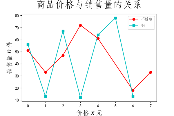
| import matplotlib.pyplot as plt
font_title={'size':24,
'y': 1.05,
'family':'STFangsong'
}
font={'size':16,
'color':'black',
'family':'STFangsong'
}
x1 = [0,1,2,3,4,6,7]
y1 = [51,33,47,72,61,18,33]
x2 = [0,1,2,3,4,5,6]
y2 = [56,13,67,12,64,78,13]
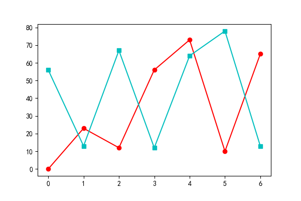
plt.plot(x1,y1,'-ro',label='不锈钢')
plt.plot(x2,y2,'-cs',label='铝 ')
plt.legend(prop={'family':'STFangsong','size':10})
plt.xlabel("价格 $x$ 元",fontdict=font)
plt.ylabel("销售量 $n$ 件",fontdict=font)
plt.title("商品价格与销售量的关系",fontdict = font_title)
plt.savefig('fig.png', dpi=100)
|